What are you looking for?
You might be looking for...
New look Santa Mònica

Exhibition
THE SANTA MÒNICA OPENS NEW QUESTIONS
THE SANTA MÒNICA OPENS NEW SPACES
THE SANTA MÒNICA OPENS NEW MEANINGS
The Santa Mònica is a living, fluid organism, like a mutable porous membrane that adapts and dilates. It is no longer a static centre but is rather in constant movement and constant transformation, and creates spaces for participation and reflection for artists and the public.
Therefore, its visual identity must be flexible, participatory, contemporary, performative and accessible in each of the centre's cycles, with a graphic style that looks to the future, without leaving the user indifferent and inviting them to reflection.
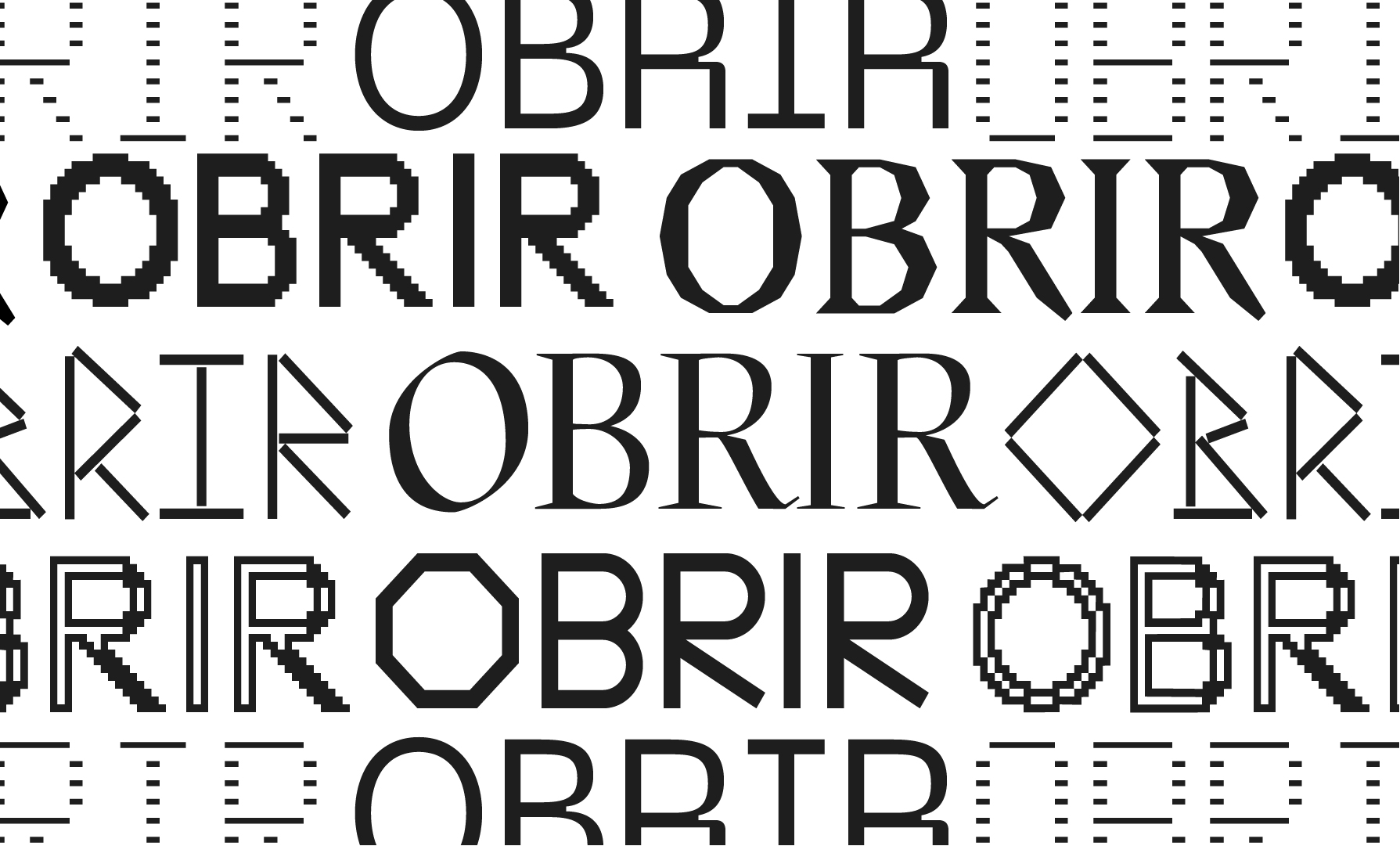
The new logo, created as a container and generator of ideas, takes as a reference the current cloister, which acts as a community resource for artists.

The new visual identity is articulated based on the idea that Arts Santa Mònica expands and opens. In this way, all the basic communication elements are off to the side, leaving an empty space in the centre. Each cycle will occupy this central space on the poster. The name of the exhibition takes on more relevance, the role of the artist draws the attention and the centre itself remains on the sidelines, as a container, a membrane.

Cycle after cycle, Arts Santa Mònica is home to artists with multiple voices. The use of different fonts both for the name of the exhibition and other identifying elements expresses this plurality of participation.
Thus, through a complex visual system, the different communicative elements coexist and take shape. The brand identity, despite being fixed, is adapted and scaled in different formats, while the image of the thematic cycles, arranged in conjunction with the centre’s artists, changes every time.